Today we’re introducing a new look for Quorum—a new logo, new colors, new design elements, and a new website to go with the new messaging we rolled out earlier this year. I’m proud of our team for incredible work that led to a beautiful rebrand that really feels like us.
Our outgoing brand and logo originated in a time when our core as a business was Data-Driven Politics: helping provide information to government affairs teams so they could identify legislative champions, track legislation, and figure out which members are most likely to work together based on legislative statistics. Our logo symbolized this data-focus, with the Q emulating a magnifying glass to symbolize all of the data and information you could search in the platform.
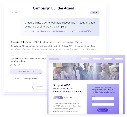
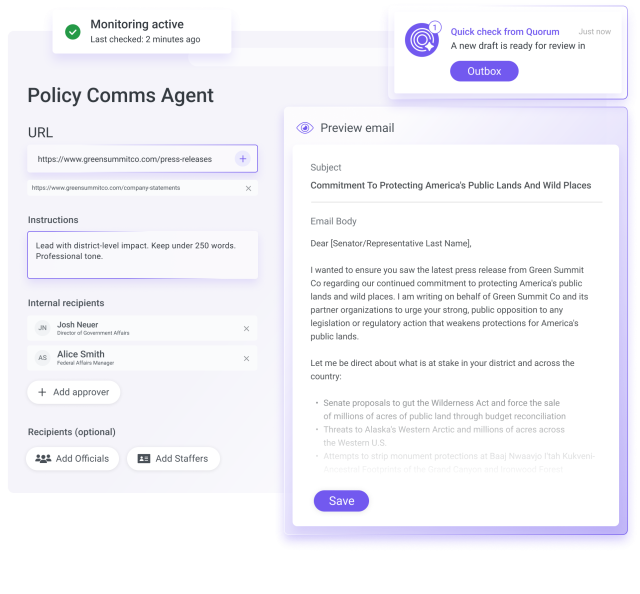
And then we grew. We launched Issue Management so users can manage their issue portfolio in Quorum. We launched the interaction logger so users can track their team members’ meetings and stay on the same page with their relationships. We launched Outbox so teams can quickly communicate with stakeholders and policymakers. We launched Quorum Grassroots so clients can make the voices of their advocates heard. We launched Quorum European Union and International. These are just the tip of the iceberg, but it is clear that we’ve outgrown our focus on data alone. We need a brand that encompasses more of who we are. We need a more consistent look that feels like us. We need a visual language that helps us tell stories. We need to differentiate ourselves and stand out from other brands.
As this project began, we reviewed customer interviews from a recent messaging project and discussed what we think Quorum is all about. When people talk about us — when we talk about us — what do we say? We kept coming back to one of our company values and a common theme, whether we’re talking about Quorum as a public affairs software provider, as an employer, or as part of the DC and Brussels communities: we invest in people.
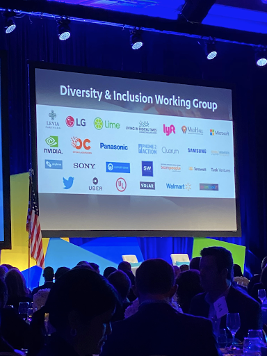
At Quorum, we put more thought into client gifts than some people do for their own parents. Our Capterra reviews say we offer the best customer service out there – not just in our industry, but anywhere. We discuss inclusion and diversity initiatives and progress at the same steady cadence as we do product initiatives, client retention goals, and sales quotas. We decorate the office with bi pride flags and black power fists, we host events and educational Lunch and Learns created to make everyone feel seen and included and important. We look for opportunities to give back to the city we live in and the people in our community. We help each other out and we shout each other out and we lift each other up with the most wholesome acts of kindness and gratitude each and every day. And it makes a big difference when it comes to how we feel about coming to work and how people feel about working with us.
With this in mind, we began building a brand archetype. Similar to a buyer persona, once you define an archetype, it can guide a lot of other brand decisions. Team members answered questions to help us narrow it down.
“The caregiver” resonates because we take care of our clients and one another as people.
“The magician” resonates because of the power our product holds to make magic for our clients and the impressive expertise on our team.
“The hero” resonates because we work hard to offer a best-in-class experience working with us and our product, because we hold each other to a very high standard, and because of how we’re able to amplify what’s possible.

We put these together and named our archetype “The Hidden Hero”: we provide support as caregivers and make the magic happen with our best in class team and technology so that our customers can shine.
Our agency, Studio Science, then took that idea and came up with using moving, multi-colored paths throughout the design to illustrate the magic and energy that keeps everything running. We’re what’s happening behind the hero: we’re constantly in motion, constantly improving, constantly working to help everyone — our amazing clients and our fellow team members — work smarter and move faster toward whatever success looks like for them.
We carry the use of paths throughout the design to tell a story and, to serve as the connective tissue between elements.
Colors
New Colors

Old Colors

Purple has become a Quorum color; we decided to hang onto it to bring some continuity to our story, but also because the meaning behind the color works. Purple has meaning in government affairs related to bipartisan politics, but it is also a color associated with power, creativity, and magic.
Our agency took our old color palette and pumped up the saturation and brought in some more contrast, including a new brass color and a bright ultraviolet.
Logo
I mentioned in the beginning that one of our goals was to differentiate ourselves. One of the things that made us consider updating the logo was seeing just how much the old logo disappeared when sharing space with other logos. Our outgoing logo is pretty and sleek, but, we thought Quorum would benefit from something a little bolder.
The images below are from earlier drafts before we made final decisions on the palette. We played with how the lines interact with people and we liked how the lines around this person form the shape of a Q. You can see on the right here a simplified, illustrated version of the image on the left — the navy outline of a person’s head and right shoulder with these radial lines wrapping around them.

![]()
After a few more rounds of feedback, we landed on our new logo:
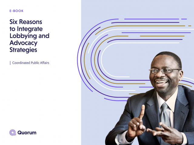
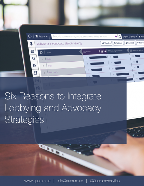
These brand elements are on every piece of digital and physical collateral you’ll see from Quorum. Here’s a final side-by-side example with one of our e-books on integrating your lobbying and advocacy strategies.
Cyrus Sussman, Theresa Hebert, Kerry Wheeler, Jonathan Marks, Grace Torres, and our partners at Studio Science have been hard at work for months to get this project to the finish line. Rebranding is a delicate and emotional thing, and from strategy to execution, they’ve been focused, careful, and thoughtful in their approach—consistently choosing what’s best over what’s easiest, pivoting, editing, and reworking entire documents sometimes when we realized things weren’t working the way we’d imagined.
Our new branding puts people out in front. You’ll see more humans. More faces. You’ll see Quorum represented by the paths moving behind the scenes. And you’ll see that our website makes learning about Quorum’s best-in-class public affairs software that much easier.
We invite you to explore our website and hope you like Quorum’s new look.
All the Best,
Jess Forrester
VP of Marketing